
Slack Block Kit messages, rendered in React.
@nkootstra/block-kit takes the Block Kit JSON your Slack app sends and draws the message, modal or Home tab the way Slack does, with the same spacing, fonts and colours. Buttons and menus work, and hand you the payloads Slack would.
Block Kit Builder only runs inside Slack. This is for everywhere else: an admin panel, a template gallery, an approval queue, a test harness for your bot.
$ npm install @nkootstra/block-kit @fontsource/lato @fontsource/roboto-monopnpm add @nkootstra/block-kit @fontsource/lato @fontsource/roboto-monoyarn add @nkootstra/block-kit @fontsource/lato @fontsource/roboto-monobun add @nkootstra/block-kit @fontsource/lato @fontsource/roboto-monoRead the quickstart Add the stylesheet, render a message, handle a click.
Try it in the Block Kit playground Paste your JSON and see it rendered. No install, no sign-in.
plan block updating as its tasks finish, rendered live by block-kit.Buttons that work
Buttons, menus, pickers and inputs work. onPayload receives the block_actions payload Slack would send your app, and a signed relay can forward it to your Bolt app.

onPayloadClick Approve or Deny.Check it against Slack
Each block is checked, pixel by pixel, against a capture of Slack's own rendering. This one matches in all of its 684,032 pixels, in Slack's light theme and its dark one. Drag across it, or show the difference.
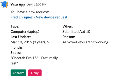
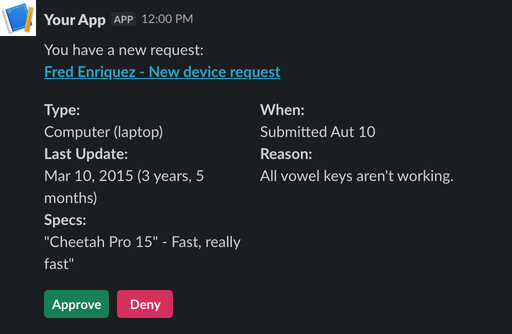
Captured in Slack's light theme.Captured in Slack's dark theme.
Red would mark pixels that differ from Slack, yellow the ones that differ only in anti-aliasing. Here there are none.
Blocks
Each one links to its docs page and live examples, including the newer agent blocks such as plan and task_card.